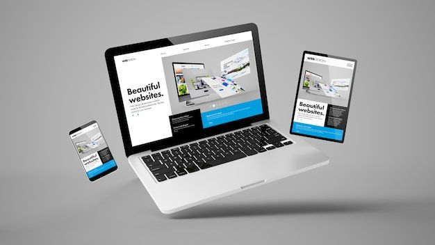
With users accessing websites across phones, tablets, laptops, and desktops, designing for a single fixed screen size is no longer viable. Two approaches dominate modern web design: responsive design and mobile-first design. While related, they represent different starting philosophies.
What Is Responsive Design?
Responsive design uses flexible grids, images, and CSS media queries to adapt a layout to any screen size. Traditionally, responsive design starts with a desktop layout and adds breakpoints to reformat the design as the screen shrinks.
Key characteristics:
- Fluid grids that resize proportionally
- Flexible images that scale within their containers
- Media queries that adjust layout at defined breakpoints (e.g., 768px, 1024px)
What Is Mobile-First Design?
Mobile-first design flips the starting point: designers build the mobile experience first, then progressively enhance the layout for larger screens. This approach forces prioritization — since mobile screens have limited space, only the most essential content and features make the cut, which often improves the overall design.
Key characteristics:
- Design begins at the smallest screen size
- Content and features are added as screen size increases
- CSS is written with
min-widthmedia queries, building up rather than down
Key Differences
| Aspect | Responsive (Desktop-First) | Mobile-First |
|---|---|---|
| Starting point | Largest screen | Smallest screen |
| Prioritization | Can lead to feature bloat on mobile | Forces early prioritization |
| Performance | Can load unnecessary assets on mobile | Generally lighter and faster on mobile |
| Complexity | Can require more overrides at smaller sizes | Progressive enhancement tends to be cleaner |
Why Mobile-First Has Become the Standard
Mobile traffic now represents the majority of web usage for most industries, and search engines prioritize mobile-friendly experiences in rankings. Starting with mobile constraints naturally leads to simpler, faster, more focused designs — benefits that carry over even to the desktop experience.
Best Practices for Either Approach
- Use relative units (%, em, rem, vw/vh) instead of fixed pixel values where possible.
- Test on real devices, not just browser resize simulations.
- Prioritize touch-friendly tap targets (minimum ~44x44px) for mobile interfaces.
- Optimize images and assets for smaller, slower connections.
- Design breakpoints based on your actual content’s needs, not arbitrary device sizes.
Final Thoughts
Mobile-first design has become the default recommended approach for most new projects, but the underlying goal is the same either way: a seamless experience regardless of screen size. Choose the approach that best matches your project’s primary user base and content complexity.