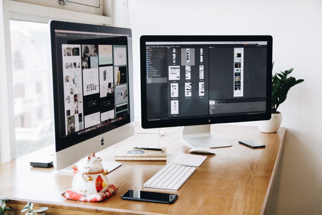
White space — also called negative space — is the empty area between and around design elements. It’s often mistaken for “wasted space,” but experienced designers know it’s one of the most powerful tools available: it creates focus, improves readability, and signals quality.
What Counts as White Space?
White space isn’t necessarily white — it’s simply the unmarked area of a design. This includes:
- Macro white space — large areas around major elements, like margins or the space between sections
- Micro white space — smaller gaps, like the space between lines of text or between an icon and its label
Why White Space Matters
1. It Improves Readability
Adequate spacing between lines (line height) and paragraphs reduces eye strain and helps readers track text without losing their place.
2. It Creates Focus
Isolating an element with space around it naturally draws the eye to it — a technique used constantly in advertising and product photography.
3. It Signals Premium Quality
Luxury brands consistently use generous white space. Cramped layouts tend to feel cheap or overwhelming; spacious layouts feel confident and considered.
4. It Improves Comprehension
Grouping related content with tight spacing, and separating unrelated content with wider gaps, helps the brain parse information faster (a principle drawn from Gestalt psychology).
5. It Balances Visual Weight
White space acts as a counterbalance to busy or heavy elements, preventing a design from feeling cluttered.
How to Use White Space Effectively
- Increase margins and padding before adding more content. Resist the urge to fill every inch of a canvas.
- Use consistent spacing units (e.g., an 8px spacing scale) for a polished, systematic feel.
- Give important elements room to breathe — headlines, CTAs, and hero images benefit most from surrounding space.
- Balance density. Not every layout needs to be minimal, but every layout needs intentional spacing decisions.
Common Mistakes to Avoid
- Treating white space as space to be “filled in” with more content
- Inconsistent spacing that creates visual noise
- Cramming text and images together without breathing room
- Confusing minimalism with laziness — effective white space still requires deliberate structure
Final Thoughts
White space isn’t empty — it’s active. It shapes how a design is read, how premium it feels, and how effectively it communicates. The next time a layout feels “off,” the fix is often not to add more, but to give what’s already there more room to breathe.